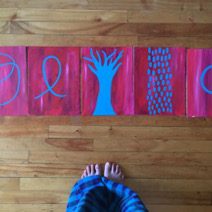
Ming Mei Ip
2nd Year, Art Education
In Loving Memory
Series of painted pieces
2019
“Art is for me a way of being present in the world, an investigation into expansive pathways of relating. When I do play with my mediums of choice, I often say that I don’t do drawing or dancing, I let my flesh and bones respond in the Now. I serve as a clear channel to receive, allowing whatever wants to come through to emerge and teach”
– Ming Mei Ip
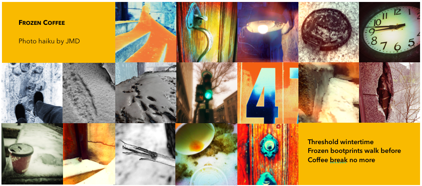
Jean-Marc Duchesne
Second year, Art education
Photo Haiku
LESSON PLAN
Students love to snap as many pics as their Smartphones will contain! The following lesson gets students to express, observe and manipulate the photographic plane in a creative and reflective process. The Haiku is traditional short written form of Japanese poetry—17 syllables arranged in three lines (5, 7, 5), while a Photo Haiku employs the same metered verse but uses images to compose a poetic representation.
Learning Objectives
Students will learn how to express themselves metaphorically and/or literally using a photo capturing device (Smartphone, iPad, DSLR). Learning how to set-up a shot (exposure triangle), how to choose interesting angles, isolating images that compose a scene, tell a story, or convey a feeling through a poetic narrative in 17 frames.
Materials
Process
A Haiku consists of the juxtaposition of two ideas. The prototype above combines: Wintertime and Coffee-break. Between these opposing ideas is a separation that acts as punctuation to emphasize, relate and connect elements to form a new idea. Seventeen (17) images arranged on three lines (5, 7, 5) create the Photo Haiku where images replace words. This project may be approached from various entry points—some prefer writing out their poem first, whilst others may choose to capture images that inspire the writing, and others still may just bypass writing and let their images speak.
| 1—Students are required to take a 20-minute timeframe at a pre-selected site or they may simply spend the time alone and upload images found over the Internet if they prefer not to go out. Here are some suggested settings and seasons: |
| Leaves blowing in the wind Wind sculpted snow First blossoms | Insects scrambling about A puddle as rain drops fall Snowflakes on a window sill | A garden patch A walk around the block An impenetrable doorway |
| On site or reflecting in silence, jot down phrases, words, or snap photos that inspire all the ideas that enter your mind. EXAMPLE: Along with written notes, I’ve also captured 27 pics (see below)— Walked over to a nearby church during a coffee break on a cold winter’s morning. Jotted ten successive observations at the church side entrance while sipping coffee and then walking through the back alley. |
frozen pile of snow
back alley walked
side doorway entrance
curved edges of white hard ice
dirty snow
bootprints in the snow
grey stone block wall
wood door and rusted doorknob
coffee break morning
litter: crushed coffee cup
winter morning
| 2—Back at the classroom, isolate those words or images that best captured the essence of place, feelings and/or thoughts: | EXAMPLE: Winter, Doorway, Bootprint, Cup, Frozen, Walk, Coffee break |
| 3—Put your word/images in a 5, 7, 5 order. There are many possibilities, so play and arrange them in all sorts of ways. | EXAMPLE: Threshold wintertime Frozen bootprints walk before Coffee break no more |
| 4— Once a student feels that the arranged images convey the intention, print the poem for appreciation, class critique and exhibition. | EXAMPLE: SEE PROTOTYPE |
Additional Ideas
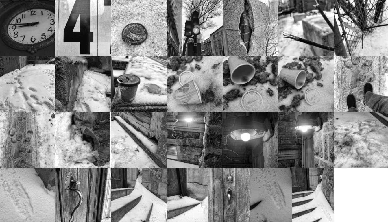
I also like to teach the possibilities of photo manipulation by using different free smartphone apps, such as, Snapseed, Lens Distortions, Fused, Tadaa and Lightroom CC. See example above: “using photo manipulation.”
Consider creating a Video-Haiku where each video capture is edited as follows: 17 shots x 1 sec. = 17 sec. total, or a Soundscape-Haiku where only sounds are recorded and assembled.
| ACTIVITY PROCESS | TIME D-1 & 2: 2x45m or D-1: 1x90m | |
| Motivation | What is a haiku? (worksheet downloadable from scholastic.com) PDF LINK: http://teacher.scholastic.com/lessonplans/pdf/dec05_unit/whatishaiku.pdf Examples of photo haikus can be found on Internet to stimulate ideas. video LINK: https://www.youtube.com/watch?v=owfJ9Zxa-iU website LINK: https://www3.nhk.or.jp/nhkworld/en/tv/haiku_masters/gallery/?period=201811&category=photohaiku | 10 min. |
| Media exploration | For those students are versed about the exposure triangle, angles of view, light & shadow, and shot composition—they should apply the principals. If not, this assignment can become an entry point into photographic arts by getting students to think about shot value but just leaving settings on automatic. | 5 min. |
| Art-making Procedure | Learners will capture images at a prior selected location. NOTE: it is important that this be done individually or at most paired. As they snap photos (more than 17) very quickly, they should also jot down phrases and words that the location inspires. Students upload on iPad and/or print the images to be arranged numerically and/or glued in a 5, 7, 5 order. | 20 min. *Break here to carry over onto Day-2 25 min. |
| Response | As a group, students will display and share their art. Here are a few questions to direct the conversation: What did you consider first? Which images do you prefer and why? How does the sum of images convey the overall idea/emotion? How are you creating intention through photo arrangement and shot value? | 30 min. |
| Studio etiquette | All photo capturing devices fully charged. Note pads and pencils made available. At the teacher’s desk a computer or iPads and a printer. A way to drop images will be determined: USB key, dropbox, class email, etc. Display boards to showcase | Teacher Prep. 10 min. |
Figures:
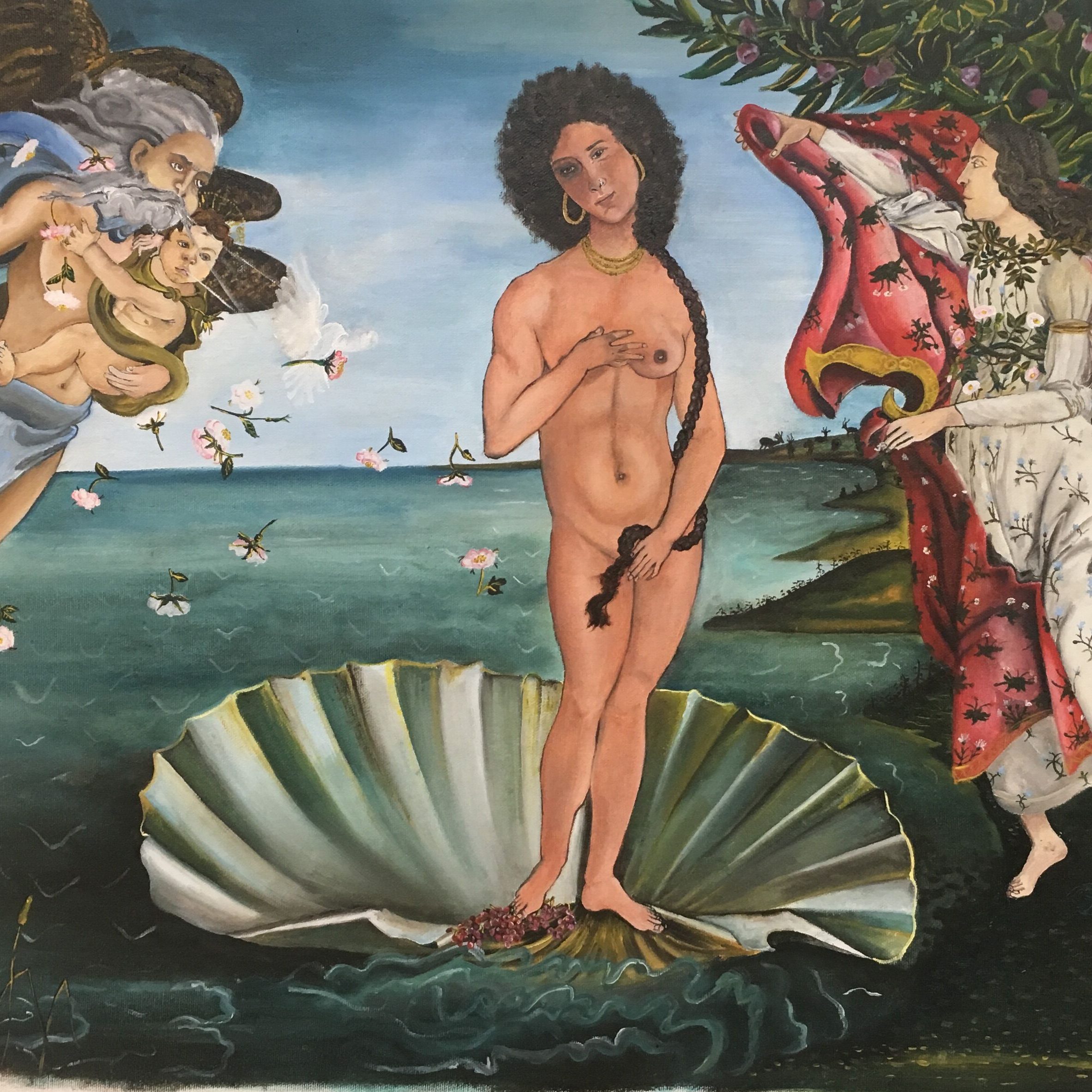
Juliette Brown
Fourth Year, Studio Art
Meditations on queer Love Fairy Tale Beginnings
2018
“Once upon a time, in a dimension similar to this one, there lived two very special princesses. Although quite far from one another, a strange situation brought them together. You see, as princesses they both had certain obligations and were under immense pressure to perform their roles. The most prominent and ever-pressing matter being to wed a prince one day. They were often objectified and seen as trophies. It left them with disdain and a bitterness towards their oppressors – but let’s talk about them, the women.” – an excerpt from the short story I wrote entitled Two Princesses: A Lesbeing Love Story.
Fairy tales bring us comfort in their predictability. The opening line sets us up for a story we know will end with, “and they lived happily ever after!” The stories we are told as children are of interest to me; however I am even more interested in the stories I did not hear as a child. We tell ourselves stories as kids, about our lives and who we think we are. We act them out in play. These stories can encourage us to strive for our dreams and pursue our passions, or they can be limiting and box us into a singular idea of who we think we should be.
I grew up in a quiet suburban neighbourhood in the greater Toronto area. As a child I was very protective of my body and shy to expose my figure. The way I dressed could be classified as tom-boy; nevertheless I identified as heterosexual and my first sexual experiences were with men. The majority of my sexual experiences have been with men. Only recently, this past year, an unpredictably strong connection with a woman prompted me to re-evaluate my personal narrative. At this point you might be wondering, who is this person? My name is Joules and I am a queer Latinx artist based in Montreal creating multi-sensory installations. I appreciate the forgiving nature of digital painting while relishing the tactility of the handmade. That being said, I am not afraid to use whatever medium necessary to convey my message. My creativity is fueled by my love life – featuring only myself with men until recently. I make art to give myself time and space to think, to heal, to express love and joy. Art is a meditative process so in developing a romantic relationship with a woman, naturally the focus of my work shifted to my queer relationship. I hope that my art empowers all queer identifying people as I outgrow the hetero-normative narrative I once abided by.
Plot Twist: Sexual Identity Crisis
Being romantic with a woman for the first time triggered a lot of big questions about my sexuality. Questions like: “Am I gay now or bisexual?” “How do I tell my family?” “Should I even bother or is this just a phase?” “Could I be pan-sexual?” “What are my motivations for liking women versus men?” I would habitually compare my past relationships with men to my new relationship with a woman and wonder if I was simply attracted to her because we could relate to each other through our shared experience of womanhood, or because of who she was as a human being? I debated the significance of gender in my attraction to her specifically and then more broadly to people of any gender identity.
With all these conflicting ideas running through my head, I was desperately seeking clarity. I wanted simple answers to complex questions and this desire created frustration. I felt like no singular term could define me indefinitely, except maybe “human” (and even that was up for debate). I really thought I knew myself until this unforeseen new love challenged core ideas. Every term felt limiting. Eventually I realized this desire to label myself stemmed from a fear of uncertainty – the desire for stability, when in reality we are fluid beings that go through constant change. The term queer seemed to be the most fitting label as it inherently defies stable identification. As an adjective, queer once meant “strange” or “peculiar;” in this case, though, I am using it as an umbrella term for sexual and gender minorities who are not heterosexual or cisgender. But labels make for generalizations, and there are always exceptions. I sought to create my own language, and a story that left room to grow and evolve. This sexual identity crisis created a need for space – space in which I did not have to define my sexuality so exclusively. Somewhere I did not have to “come out” to anyone as anything. I desired a space in which I could simply exist with my partner and feel peace, acceptance and love.
Rewriting the Narrative
The origin of my queerness was a question that nagged me relentlessly, so I prompted myself to write an origin story. The result was Two Princesses: A Lesbeing Love Story, a fictitious legend of two women in the face of oppression that fall in love with their womanhood and eventually each other. The short story was typed by hand on an Eaton Viking Deluxe Typewriter, later digitally scanned and mass reproduced; yet the hand-typed imperfections are a detail that should not go unnoticed. The use of the typewriter is a nod to the surge of women’s liberation during the period of its invention in 1878, while simultaneously suggesting a longer history of inequality, including women’s unpaid labour as secretaries, typists and editors for male writers – usually their husbands.
Two Princesses is the fairy tale I wish existed when I was a child. It is a story that deviates from the usual narrative. These two princesses are not pitted against one another. They do not want for material things. These resourceful princesses do not need a knight in shining armour to save them. They are able to rescue themselves from oppression and find the realm in which the spirit of the Lesbeing resides. The realm where they can be completely free of judgement and fetishization. Writing this story to my younger self helped me come to terms with the development of my queer sexuality.
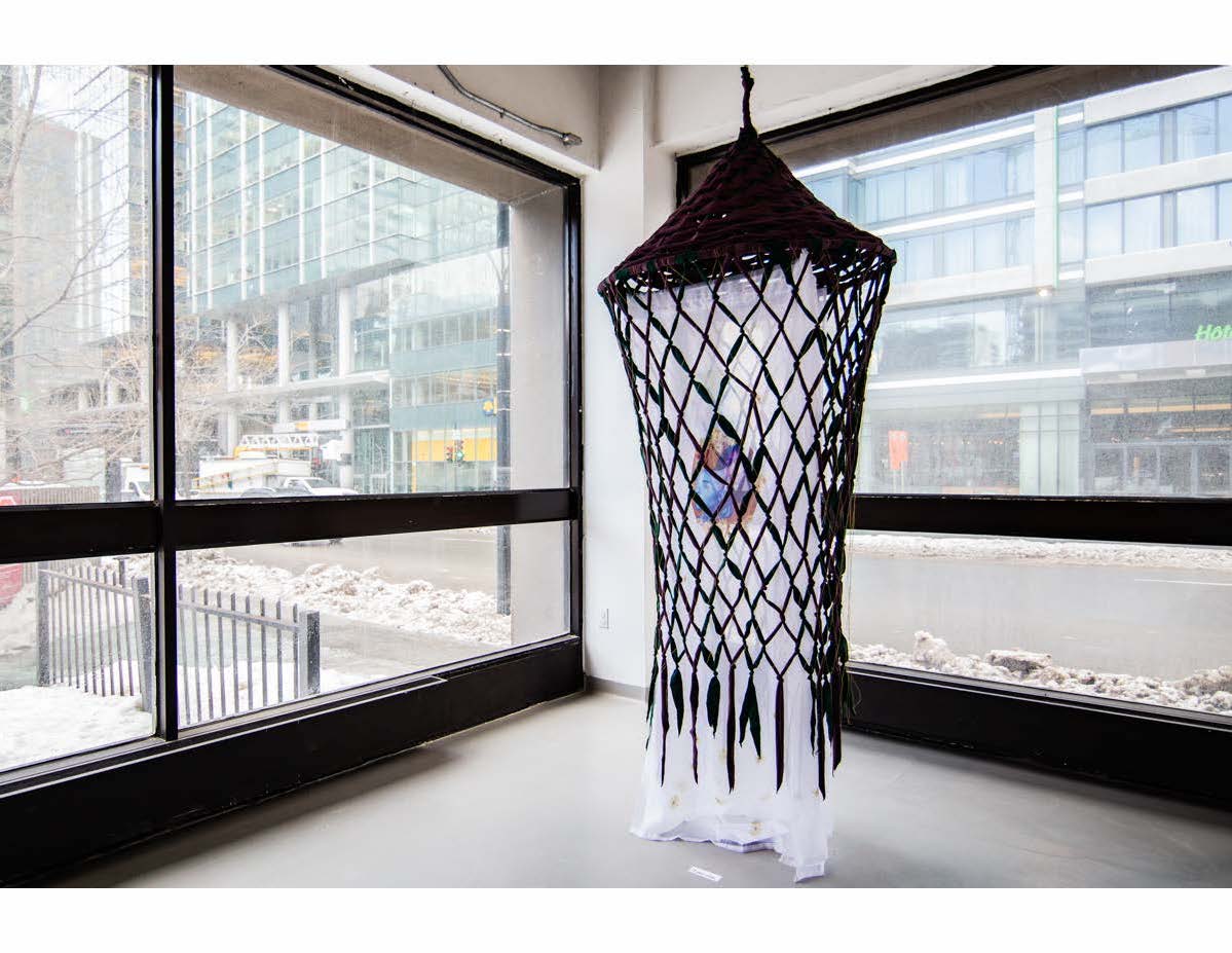
In order to represent the realm of the Lesbeings, I materialized a new artwork entitled, A Space Where We Can Exist, a virtual love nest created by the Lesbeings. A tent-like structure with a netted exterior and a woven roof; housed inside is the Lesbeing Love Legend, a stack of pamphlets which further informs the desired space for the couple to be who they are: proud and liberated. I see the Lesbeing Love Legend as a seed that can be brought home and propagated by visitors. The material choices for the net (purple fleece and green cotton-poly blend bed sheets) refer back to childhood forts and that sense of playful resourcefulness. The finer net made of gold thread adds a touch of magic to this ethereal force-field. Behind the double layered net, three iconic portraits hang on lengths of semi-transparent white polyester which depict moments of pure bliss and exude unwavering pride. Each banner is showered in a sunflower motif that symbolizes loyalty and longevity; qualities essential to a healthy long distance relationship. In this realm, the scared child wrapped in a blanket receding into their closet becomes an otherworldly being capable of magic. The Lesbeings are powerful but vulnerable creatures that express themselves freely. The net that surrounds and protects its inhabitants acts as a barrier between chaos and serenity, the material world and the infinite realm of the Lesbeings. In a relationship that exceeds many boundaries, be they international borders, hetero-normative constructs, cultural and racial binaries, A Space Where We Can Exist is a reserve for the lovers to retreat into – free of judgment. The piece says a great deal about the nature of our relationship and how sacred our connection is. I needed to let go of the turmoil I felt about my sexuality and make space for infinite states of being to exist without labels. The space I have created embraces the grey area marginalized groups fall into. With elements that blend and weave, each layer influences the next. The net both obstructs and reveals part of the portraits the lie behind it. The overlapping visuals reflect the complexity of navigating the world as a queer femme and reject the common assumption is that one is born straight or gay. A Space Where We Can Exist is unapologetically queer and answers to no one.
Gaily Ever After
A Space Where We Can Exist takes up a fair amount of physical space while being relatively portable and easy to set up/dismantle. It demands a full walk around or a good spin to take in its multi-faceted entity. Intrigued by the pamphlet placed inside the tent, participants usually wonder, “Are we allowed to go inside?” One is invited to engage with the story but the limited space inside the tent and layers of fabric and netting suggest that the space is reserved, not open to visitors. The piece brings up issues of permission and boundaries. It is generous in that it gives the viewer an intimate look at my relationship with a woman; it tells an intimate story of adventure, passion and love but restricts the viewer from occupying our space. Some initial reactions of the piece have compared it to a birdcage, a fitting comparison as it implies the captivity of free spirits. My partner and I being the free-spirited birds trapped in a world dominated by hetero-normative propaganda. Creating this piece was a way of rewriting my personal narrative to include queer love and celebrating the spiritual and emotional connection I have always craved. I want this piece to trigger ideas about limitations – the boxes we close ourselves into. For the majority of my life I sought after a deep, romantic and spiritual connection with a man, disregarding the population of women around me as capable of providing that. I craved the approval of men specifically. When a woman came into my life and started providing the connection I longed for, I realized the need for a man’s affection was a patriarchal device implanted into the media I had been consuming all my life. My piece is an attempt to combat hetero-normative media and inspire people to broaden their horizons about who they look for love in.
I hope my piece inspires people to look beyond the typical fairy tales we grow up with and create their own unique ideas about love. Who will you find love with? Would you turn away from a love that challenges your preconceived notions, or embrace it with open arms? When people interact with my piece, I want them to start questioning the hetero-normative conclusions we unconsciously jump to. Is this idea about love my own? Where did this idea come from? The piece is meant to capture the essence of love felt in a queer relationship and hold space for it – validate it. I want to encourage my audience to open their hearts to love regardless of sex, gender, race and ability. Make your love your own.
Notes:
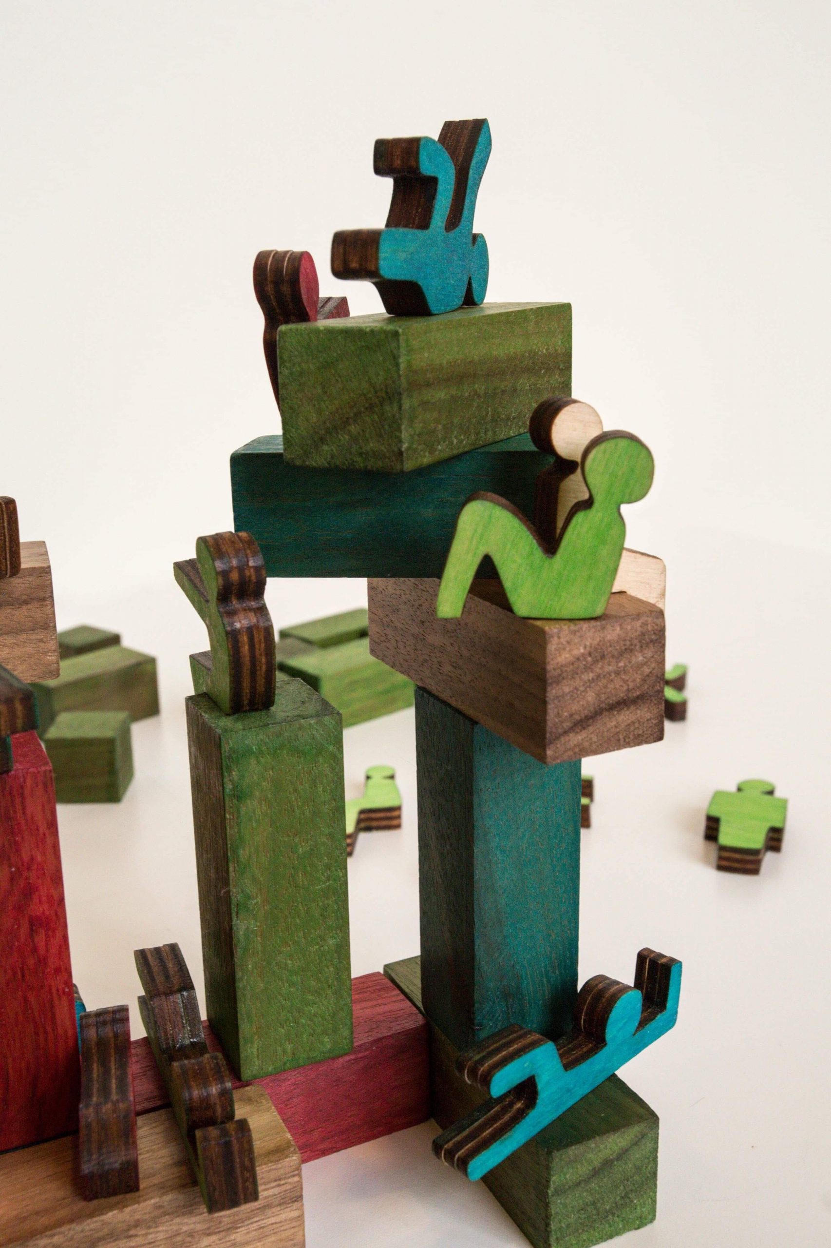
Therese Hoang, Bash Hong, Dao-Li Leboeuf-Roy, Charles Gringas
First year, Design
Why Not Walnut
walnut wood
2018
Why Not Walnut is a construction game that consists of building blocks and various characters, in the colours red, blue, green and its natural wood finish. Our team created the title, Why Not Walnut, after the material it is made of, which is walnut wood. This game is meant to be played either alone or with friends by stacking up the blocks and balancing the characters on the structure. As a balancing game, this may require some teamwork, which encourages harmonious emotions as each person works together. On the other hand, playing this alone can allow the player to unleash their creativity and use their imagination to build their own narrative. In terms of the colour palette chosen for this game design, most of the colours used are primaries, hence instilling a message of playfulness, and many other positive feelings. Altogether, we hope that Why Not Walnut can stimulate various types of emotions, including fun and nostalgia, and serve as a team-building game.
Fourth year, Art Education
Thank you
29 x 18 inches, oil on canvas
2018
I’m sorry *
17 x 24 inches, oil on canvas
2018
Please forgive me *
27 x 22 inches, oil on canvas
2018
The Ho’oponopono *
on going, mixed media
2017
I’m too much and not enough.
Too talented and not enough to be called an artist.
Too good and not enough to go to heaven.
Too bitter for sweet hearts and too sweet for bitter ones.
Too fragile for life’s waves and too strong for its storms.
I’m too much and not enough.
Too much to accept myself and not enough to love it.
Too full of feelings to write and not enough to be a poet.
But in the middle of being too much and not enough, I found myself.
So I’ll paint anyway.
I’ll write anyway.
And I’ll be anyway.
*not included here
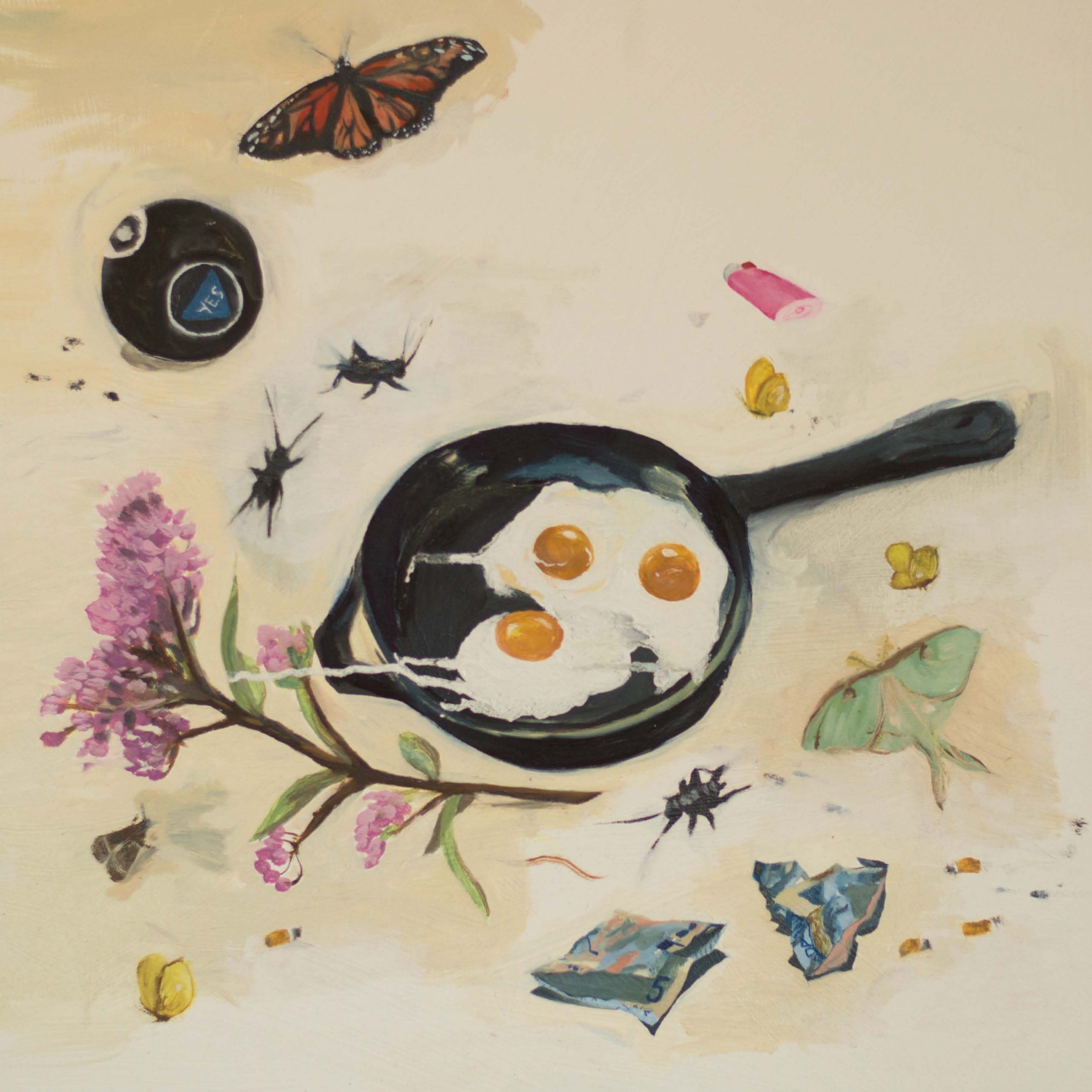
Laura Douglas
Second year, Art education
Still life with eggs and money
24 x 24 inches, oil on canvas
2017
Still life with dandelion *
24 x 24 inches, oil on canvas
2017
Something forgotten: objects kicked to the side by a careless foot; what is revealed at the edges of the sidewalk when the snow melts; nostalgia, or longing for something you never had, or had but did not want. Hidden treasure mixed with trash; detritus of memory. The items in these paintings evoke a specific time, place, and series of memories for me—but at the same time they don’t, because by nature our memory slips away. Some of the images that represent a memory might have been added later, and as the only witness to that adaptation, we will still never know the truth. In these paintings, I tried to lovingly paint items that make me feel happy (the bugs, the candy necklace, the flowers, the magic eight ball), as well as items that I feel negative or neutral about; items valued, and items relegated to the garbage. I wanted to celebrate these memory-laden items by placing them in a still life, a place of significance where they might not usually be found. At the same time, I wanted to temper that celebration by depicting the objects strewn on the ground, amidst the bugs and the dirt and the pollution. Our memories are selective, compositional even. In remembering, we pick and choose.
Laura Douglas lives and works in Montreal, QC, where she is pursuing a BFA in Art Education at Concordia University. She previously completed a BA in English and Environment from McGill University (2014). She grew up on the small island community of Wolfe Island, Ontario, surrounded by farmland and water, an environment and experience which informs much of her work. Her work has been displayed in solo and group shows on Wolfe Island, ON, as well as in several venues in Montreal, and has been featured in several online and print publications including Rookie and Scrivener Creative Review.
*not shown here
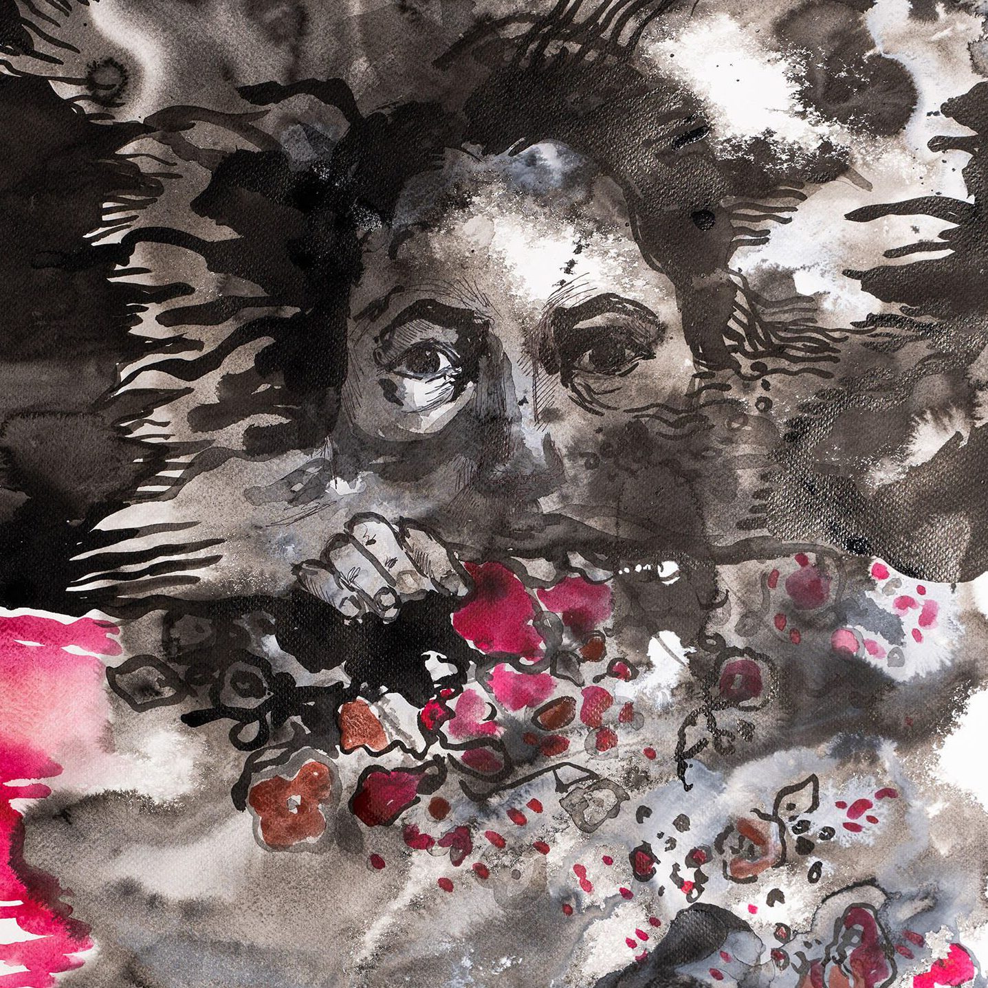
Iryna Merkulova
Third year, Painting and Drawing
Fear
ink on watercolour paper, 22 x 28
2018
Anger *
ink on watercolour paper, 22 x 28
2018
Disappearing *
ink on watercolour paper, 22 x 28
2018
Voice of frustration *
ink on watercolour paper, 22 x 28
2018
This series was created as a part of a project that includes abstract self-portraits focusing on an emotional state rather than a physical appearance. Making this work helped me to reconnect with myself and recognize the emotional issues that I am facing. Awareness is the first step towards healing. My artworks express anxiety, fear, frustration and pain that are related to a physical and emotional state. It feels like, today, the overwhelming speed of technology impacts the way we communicate with people. Immersed in our gadgets, we are losing eye contact and, with it, connection. I believe it’s one reason for a decreased ability to understand each other. Do we feel misunderstood? Do our words really reach the person we are talking to? At times I try to break the wall, but all the efforts seem unsuccessful. Frustration settles in like a fog. Still, I believe in common ground: most of us share the same issues, yet we think we are alone in our struggle. Can you relate? In this series, I opened up these emotions to viewers hoping to establish connection.
* not shown here
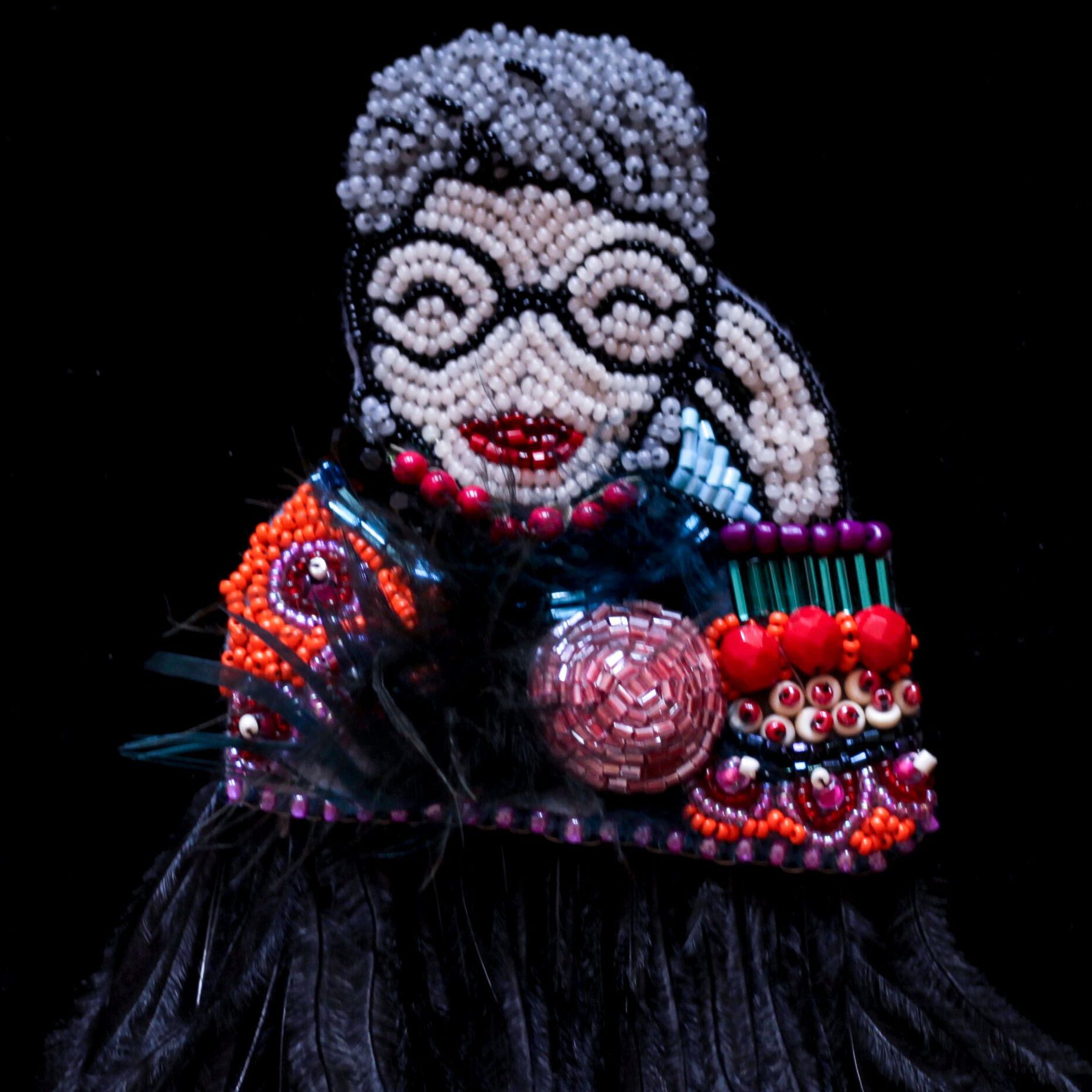
Ira Polak Veronneau
First year, Art Education
She is an ikon
beads, embroidery on felt (brooch)
2018
Saint-Soleil*
beads, embroidery on sneakers
2017
Skeleton in my closet*
tambour beads, embroidery on mono print
2018
Underwater*
beads, embroidery on silk organza and felt (brooch)
2018
Artist Statement:
I was born in 1979 in Moldovia in the former USSR. When I was 13, my family immigrated to Israel. I hold a bachelor’s and master’s degrees in social work. During a humanitarian mission in Haiti after the earthquake in 2010, I met my future husband Felix-Antoine from Montreal. Together, we travelled and worked in Israel/Palestine, Sierra Leone, Senegal, and Haiti. We moved to Montreal less than two years ago.
I began to practice needlework in my childhood. My grandmothers, Mania and Bluma, were the masters of their craft, they taught me hand and machine sewing techniques, as well as traditional Moldovan embroidery. I first engaged in art, design, and fashion as a hobby. Five years ago I began combining my two passions: needlework and beads. In the bead painting practice, I normally begin with a basic contour, spontaneously adding beads, shapes, and figures, often creating 3D relief. Initially, I never have a clear vision of the image, I let the colours, shapes, and my emotions lead my creation. I regard beadwork as my own kind of meditation.
In 2015, while working in Haiti with PRODEV, a local NGO involved in the field of community work and education, I encountered drapo Vodou artists who create iconic mosaics of sewn beads, sequins, and buttons using several embroidery techniques. I was moved and inspired by their work, spurring me to not only develop my art and craft practice but also to invest more time in the creative process. I ended up launching my brand, “Babooli Beads Art”, crafting bespoken pieces of embellishment, jewellery, and decor. The brand’s name comes from the Russian diminutive of babushka (grandmother) and is a tribute to my talented grandmothers who were role models of creation for me.
The “Saint-Soleil” piece was inspired by Haiti’s art movement of the same name. In 1973, renowned artist Jean-Claude “Tiga” Garoute (1935-2006) opened a community workshop and invited mountain farmers to engage in art making. Their paintings typically represented human figures surrounded by abstract patterns. While exploring the Saint-Soleil art, I felt a strong connection and passion to join the movement by creating a piece inspired by Tiga using needlework. This beaded artwork is a homage to Haitian art, folklore, and history, as well as my own roots and traditions.
*not shown here
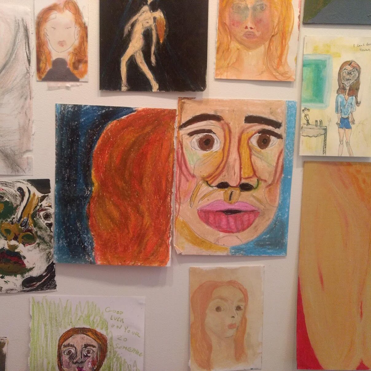
Chloe Lalonde
Second year, Art Education and Anthropology (double major)
Untitled/Collection of self-portraits
mixed-media
2016–ongoing
Artist Statement:
This on-going collection of intimate self-portraits have been my way of coming to terms with, defining, and learning to love myself. Each portrait is visually and stylistically different, and some look nothing like me. The only truly static element is my fiery hair and brown eyes. This body-dysmorphia is altered by my mood, which varies from day-to-day, dependent on so many factors, including the weather or the food I eat. Trying to remember what I look like, I choose to work with mixed media, capturing myself at my softest, darkest, most relaxed, anxious and natural states. Once ashamed of these drawings, I now include them in my body of work. These vulnerable drawings guide me on my journey to self-love, learning to accept myself as a dynamic, ever changing beautiful being. They hone in on the changing states and shapes of my body, curves of my nose and cheeks, vibrancy of my hair and wandering mind. I am all of these and I am more. I am more than my hair and body, but those drawings haven’t been completed yet.
Copyright © 2025 InArte Journal. All rights reserved